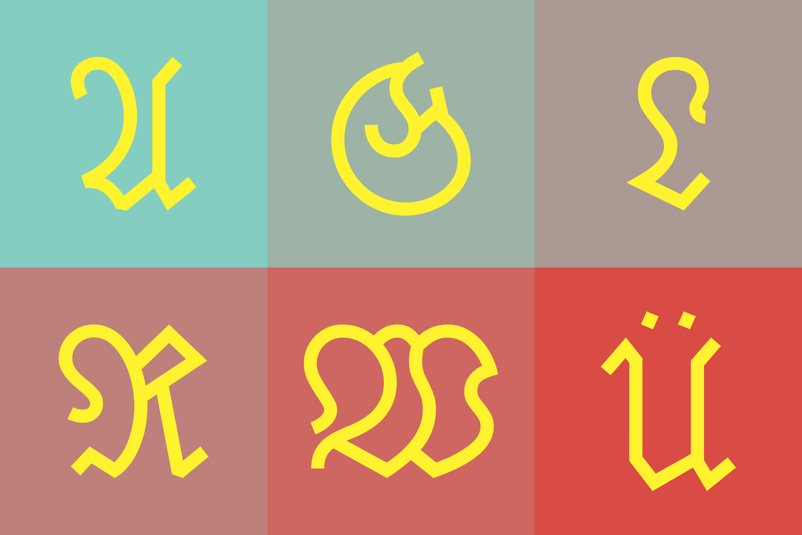
DeFraktur
We see it on motorway restaurants, hoping for a homey and traditional touch and we know it as the go-to typeface to put under a tattoo of a swastika, aiming for a different kind of nostalgia. Seldomly used, but when it is – full of resonating implications.
Fraktur is a group of typefaces with an intense history that took an abrupt end, resulting in poor reputation and the almost impossible attempts of using it free of prejudice.
DeFraktur serves as an effort to rehabilitate a font that was – possibly wrongfully – deleted from the collective memory; it seeks the initiation of a discussion about readability and progress, about typography’s immanence of character or even nationality, about allegedly proper typeface settings of Fraktur and their actuality (e.g.: Does the 21st century need three different glyphs of the letter s? Does the renaissance of a forcefully buried typeface implicate that we have to use the same settings for it that they used 100 years ago – just because it didn’t undergo the progress other fonts did?)
DeFraktur is a Fraktur without the Fraktur (ger. for breach/fracture) and therefore a contradiction in itself. It is not drawn with pen and ink but digitally and does not consist of alternating line width. On the contrary, it does capture attributes of the Fraktur and scrutinizes them – like the so-called „Elefantenrüssel“ (ger. for elephant’s trunk) of the capital letters B, M, N, P, R, V, W and the varying glyphs of the letter s.


